Client’s Vision
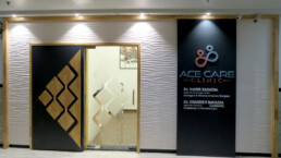
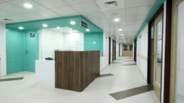
The client’s vision was to design a speciality clinic with luxurious high-end interiors which goes hand in hand with the branding and vision of the clinic.
We were entrusted with Facility Planning, Interior Design, MEP Co-ordination and Execution Assistance
Technical Specifications of the Project
| Particulars | Description |
| Scope of Work | Facility planning for the following spaces.
Other areas of scope of works were Architectural & Healthcare Consultancy, Interior Design, MEP Design, Execution Assistance |
| Project Team | Principal Architect – Ar. Kshititi Nagarkar
Project Head – Siddhi Karalkar Project Architect – Ar. Ravina Patil |
| Collaborations | – |
Our Approach for Executing the Project
- Stage wise planning and designing of the project was carried out after discussing all thoughts and ideas with the client so that they could be reviewed before being finalised and incorporated in the design.
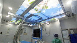
- All technical and functional aspects of the design were considered keeping in mind the physical care needed for a patient.
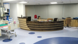
- The interiors were designed in such a way that it helps to soothe the patient. Very minute details were considered to enhance the visual appeal and ambience of the facility
Salient Features of This Project
- Careful planning and detailing went into designing OPD Rooms.
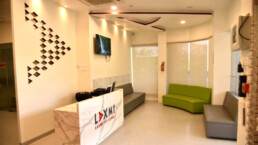
- The clinic interior design was planned to carry forward the branding via colour schemes and minimalism.
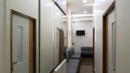
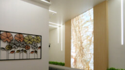
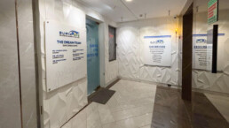
- Natural rubber wood sheet was used instead of laminates to open up the space and impart a “visually enlarged” and natural look to the narrow entry corridor.
- Wall panels from MDH were used to create a “3D Wall Effect”.
- A new logo was designed using colours and theme to match the interiors of the clinic.
- Onyx – A natural stone was added in the waiting area, this stone is backlit with a light source, so when lit, it supplements the natural lighting of the clinic, creatively opening up the space and adding to the visual appearance.
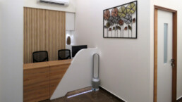
- The reception was designed so as to accommodate a small in-house pharmacy as well; storage cabinets were created to maximize the use of space.
- A beautiful chandelier glamorously enhances the reception area.
- Artificial garden in the waiting area adds to the aesthetic appearance of the clinic.
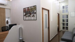
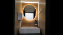
- Mirrors were added in the waiting area to give the illusion of depth and an open feel and reflect light to make the area brighter.
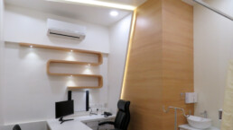
- Laminates used inside simulate natural wood.
- A spacious pantry room provides refreshments; a basic phlebotomy set-up was also added in this space.
- All shutter dustbins installed in the clinic were in closed spaces so as to decrease the contamination factor.
- Flooring tiles in a brown shade were chosen to compliment the white coloured inner walls to keep the colour pallet subtle.
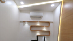
- A dash of colours through antibacterial paint and laminates add a soothing and relaxing feel to the space. The play of light using creative lighting fixtures and mirrors further enhance the lush and luxurious feel of the clinic interior design.
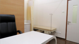
- Separate OPDs were created, one each for Urology and Paediatrics.
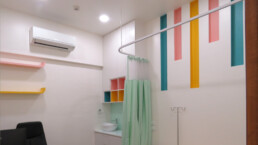
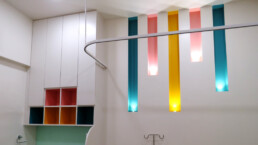
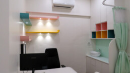
Paediatric OPD.
The Paediatric OPD was designed with a colourful “Kid Friendly” theme. To add visual focus, vertical and horizontal colourful light bands were created in the walls and colourful storage shelves with integrated lighting were also created.
Urology OPD
A unique table with a bendable laminate sheet was placed in the Urology OPD, inbuilt storage areas were created to better utilize the space.
Our Achievements through This Project
A Spacious, luxurious, and well executed turnkey project was completed in short span of time, keeping in mind the client’s requirements, budgets and timelines while following Covid-19 safety protocols.
Share
